this post was submitted on 12 Feb 2024
116 points (100.0% liked)
games
20527 readers
383 users here now
Tabletop, DnD, board games, and minecraft. Also Animal Crossing.
-
3rd International Volunteer Brigade (Hexbear gaming discord)
Rules
- No racism, sexism, ableism, homophobia, or transphobia. Don't care if it's ironic don't post comments or content like that here.
- Mark spoilers
- No bad mouthing sonic games here :no-copyright:
- No gamers allowed :soviet-huff:
- No squabbling or petty arguments here. Remember to disengage and respect others choice to do so when an argument gets too much
founded 4 years ago
MODERATORS
you are viewing a single comment's thread
view the rest of the comments
view the rest of the comments

It's fine when it's diegetic, like in Dying Light there's a bunch of marked parkour paths that have been set up in-universe by the couriers running around using them. When it's not diegetic but is necessary because of ambiguous art design then it's not the problem in and of itself, the sort of linear-cinematic path design in a cluttered open environment is. Like it's the low-effort solution that a bunch of lazily high-effort AAA games love because it let's them create flow in a tightly controlled environment where they can make big action-feeling things that are basically (or literally, sometimes it's literally) cutscenes but that still make the player feel like they're doing something.
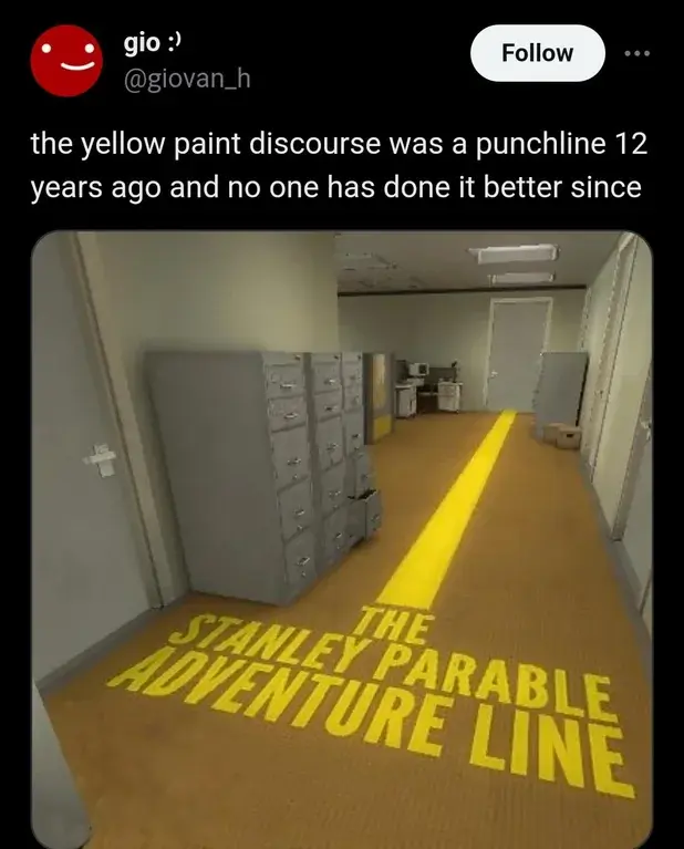
That's exactly it. You put it better than I could. Lazy design begets more lazy design. We can't let the players drive their own experience, because that's hard to do, so we'll more tightly control the experience. Oh no, we narrowed the field of possibilities so much that this is essentially a theme park ride, let's add a bunch of visual elements and vertical/horizontal movement to disguise the lack of player agency. Oh no, we did so many things to obfuscate the linearity of the design that we made it confusing to navigate, let's add visual indicators to the only viable pathway so that players don't get lost. Oh no, our visual indicators break immersion because there's no in-game reason why all this stuff should be painted yellow. Oh well, I guess we'll ship it anyways and then fire 200 developers so that the stock price goes up.
I think it's also good if your art design is built around it. In Mirror's Edge the paint is red instead of yellow, but the levels are strictly linear so the red keeps you moving in the right direction, and also looks good along with that game's cel-shading and bright colors.
Extremely linear racing games can have lines, who cares. If they are convincingly part of the environment, even better.
For any type of action or adventure game though it completely destroys the entire purpose of the game to me and breaks the 4th wall, destroying all immersion and illusion of adventure. I absolutely hate the trend in games to make checklists of errands for you to do, and telling you exactly where to go on the map. Removes all the magic and makes me into an errand boy instead of adventure hero.
Quests should be epic, mysterious and able to be approached in many different ways. More BG3 type level design please.