this post was submitted on 10 Jun 2024
92 points (100.0% liked)
games
20527 readers
130 users here now
Tabletop, DnD, board games, and minecraft. Also Animal Crossing.
-
3rd International Volunteer Brigade (Hexbear gaming discord)
Rules
- No racism, sexism, ableism, homophobia, or transphobia. Don't care if it's ironic don't post comments or content like that here.
- Mark spoilers
- No bad mouthing sonic games here :no-copyright:
- No gamers allowed :soviet-huff:
- No squabbling or petty arguments here. Remember to disengage and respect others choice to do so when an argument gets too much
founded 4 years ago
MODERATORS
you are viewing a single comment's thread
view the rest of the comments
view the rest of the comments


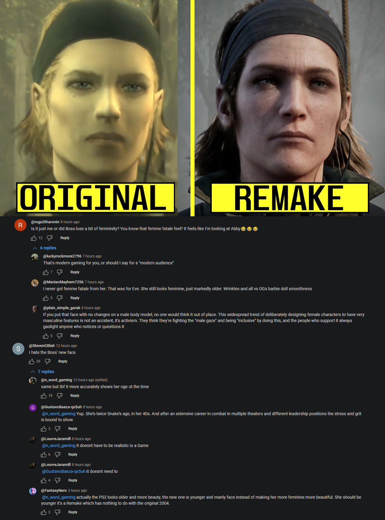
Ignore all the skin details: the jawline, cheekbones, brow, and nose are identical between them. The eyes looked slightly different but I think it's just that they're partially closed. The only real difference is that the mouth is slightly wider, and that's both extremely minor and probably down to the artist not prioritizing that when remaking the model for photorealism. The rest of the seeming differences look like illusions resulting from the skin texture.
This is probably the most closely matched redesign I've ever seen: all the permanent structural bits of the face are the same between them with all the slight differences being soft tissue, the styling and coloring of hair, and the animation of muscles that the original lacked.
Actually, looking at it again, 99% of the difference is makeup. The left face looks like the right face with makeup.
Either you are going nuts or I am because those two portraits are looking nothing like each other
I'm dying laughing now that I've realized the difference is a box of hair dye, a bottle of foundation, and some blush. Also the original is like this soft-focus 3-point studio lighting that further amplifies the effect. Like you could literally recreate these two pictures with one actual person: take the right picture in harsh sunlight without makeup, then they dye their hair, put on the foundation and contouring shit, then retake the photo with shade and reflectors set up all around and the camera slightly unfocused and it's that exactly.
Now I get why you're missing it though, if you've never done makeup or looked too close at how it works and the theory of what one does with it.
The hair colour and lighting especially here makes my point - why change it? Does everything have to be realistic grim dark now as if modern technology couldn't reproduce soft focus 3 point studio lighting? We can't make characters blond anymore?
I don't care whether it's hot or whatever I'm just genuinely wondering what the point is to change the character so much. Like if you'd reimagine it, go hog wild, but this is Konami after kicking out Kojima, they're not gonna change shit about the golden cow that is MGS3
To match set and environmental design and how that's shifted with rendering technology? The original has this "overcast day diffuse lighting, supplemented by reflectors and artificial lights" kind of look, the remake looks like a normal day - that says the intent with the original was not "everything is always cloudy and diffuse in a way that's just perfect for photography" and that was just a concession to the lighting and shadow rendering tech of the day.
As for hair, who knows, though I'd guess based on the way the hair is nearly identical where the light is harshest they may have decided that changing it actually makes it match the look more: compensating for the brighter lighting and the lighting interacting with the hair by darkening it so it's brought back to the same level. The original hair tone was likely washed out and wound up looking white with the modern lighting engine, or something like that.