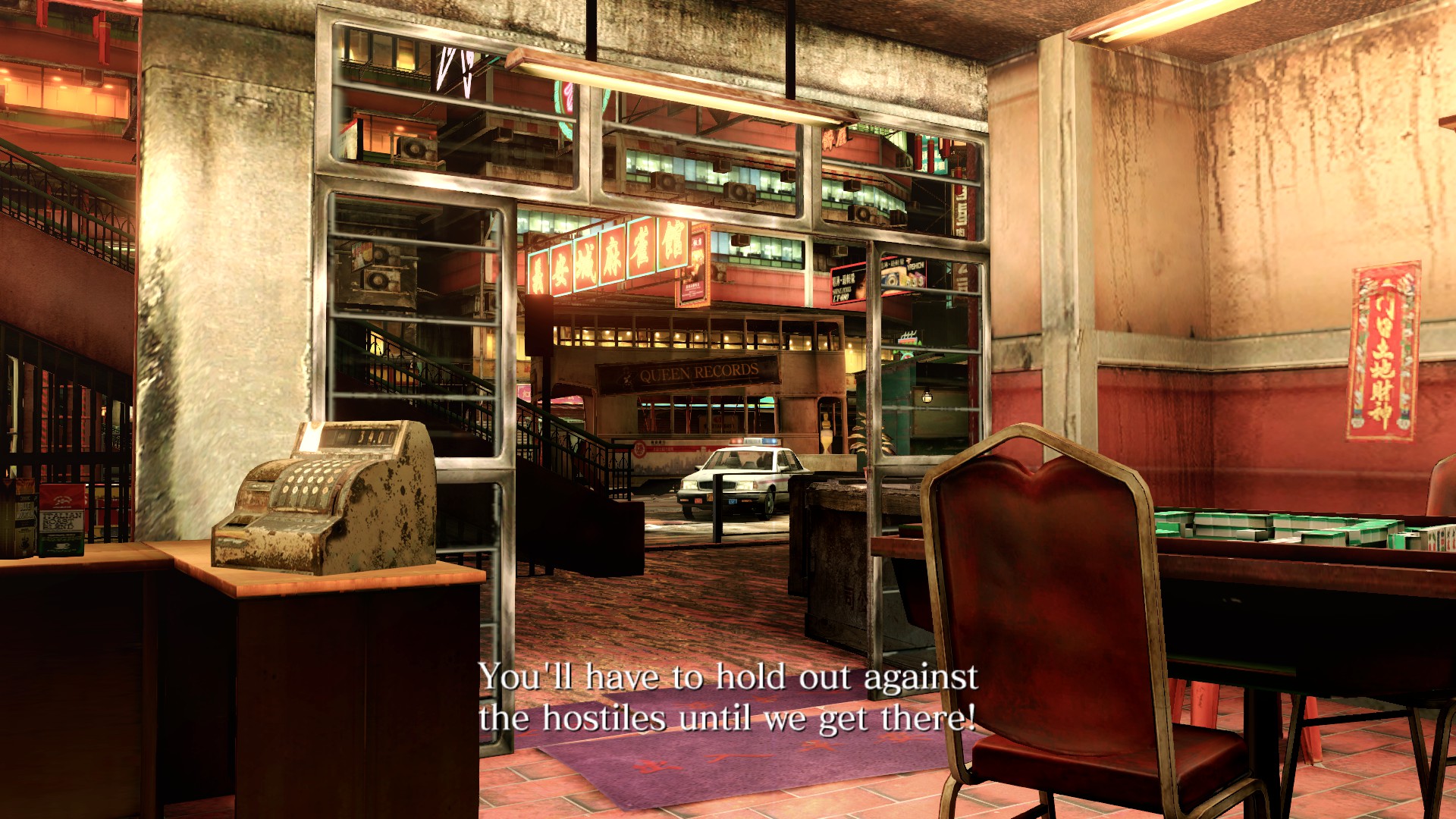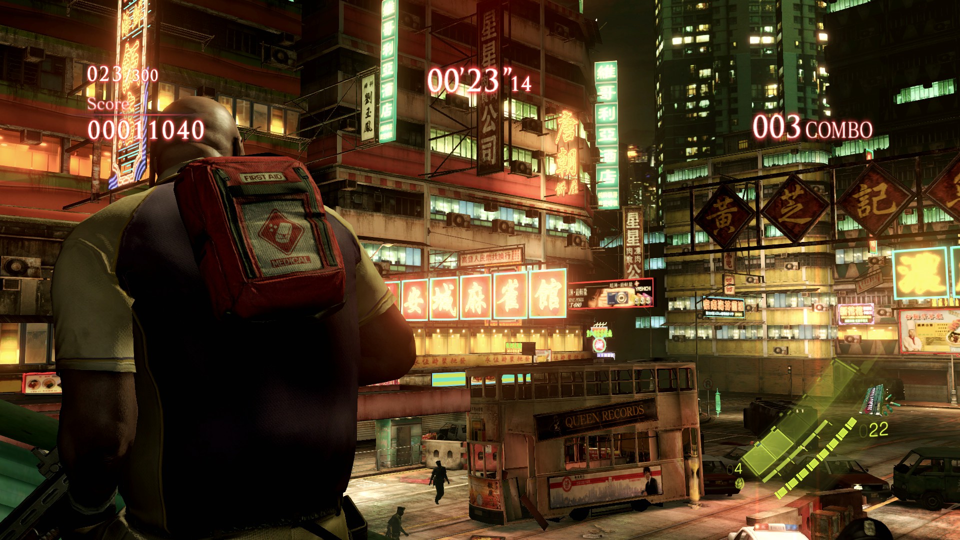
Everything's just so densely packed with detail, both large and small scale. These exterior city scenes are massively helped by them being set at night and being lit mainly by neon lights, but there's just so many lights and signs everywhere it really makes things pop. All the interiors are jam-packed with all kinds of little props and wall decorations, and I really like the cramped, dirty and run-down apartment complexes you visit in the game despite them not being all that much fun to play in. They just feel really immersively lived-in.
Here's a really cool location from Chris' campaign that you only visit for a brief boss fight and have no reason to linger in. I didn't even remember this place from my previous playthroughs and probably assumed it was a generic video game dungeon level, but it's really interesting:
You have this dark, grimy and trash-filled inner courtyard in an apartment complex. It looks like it's underground, but it's actually an open-air space that's covered by a netting with sunlight being blocked by the massive amounts of garbage accumulated on said netting, and you also have a dense tangle of electric cables and wires crisscrossing from building to building. Most of the courtyard is taken up by an older brick building that looks like it predates the apartment complex.
It must've taken tons of artists tons of work to design this intricate space that the average player is going to spend less than ten minutes in, and who aren't going to notice the nice environment art anyway since they're too busy trying to electrocute a giant boa constrictor while they're there
spoiler
I started replaying RE6 after my last post about it and I think that 12 years after launch I'm coming around to forgiving the game

It's definitely a different look from all the Unreal Engine 3 etc. games from the era. It's hard to articulate but I almost get a sort of "PS2 game on steroids" feel from these graphics. Something about the grainy and kind of desaturated textures and often flat-looking surfaces.
MT Framework fucks
There's some really fun show-offy stuff in the game like Chris' opening cutscene where some cutscene props are amazingly hyper-detailed like Piers' steak and Chris' glass of vodka. The character models mostly look really nice too
Conversely there are some in-level assets (look in any dumpster!) that would not be out of place on the Dreamcast. Such a land of contrasts...
It all evens out nicely though with the sheer amount of little details everywhere. It all looks convincing at a glance and the game expects you to proceed from setpiece to setpiece quickly
RE6's environments certainly hold up better in closeups than Halo 4's which look like blurry barren wastelands
Halo 4 what did they do to you...
But yeah MT 2.0 had some nice lookin stuff, RE6 has been getting reevaluated lately now RE games are good again lol