Data is Beautiful
2286 readers
3 users here now
Be respectful
founded 1 year ago
MODERATORS
1
2

3
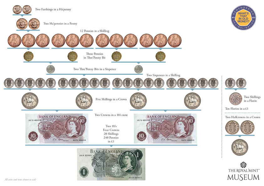
Post inspired by this recent comment about how useful 120 is (or 240 in this case), because its can be evenly divided so many ways: https://sh.itjust.works/post/40842670/19379837
Source: https://www.royalmintmuseum.org.uk/journal/history/pounds-shillings-and-pence/

5
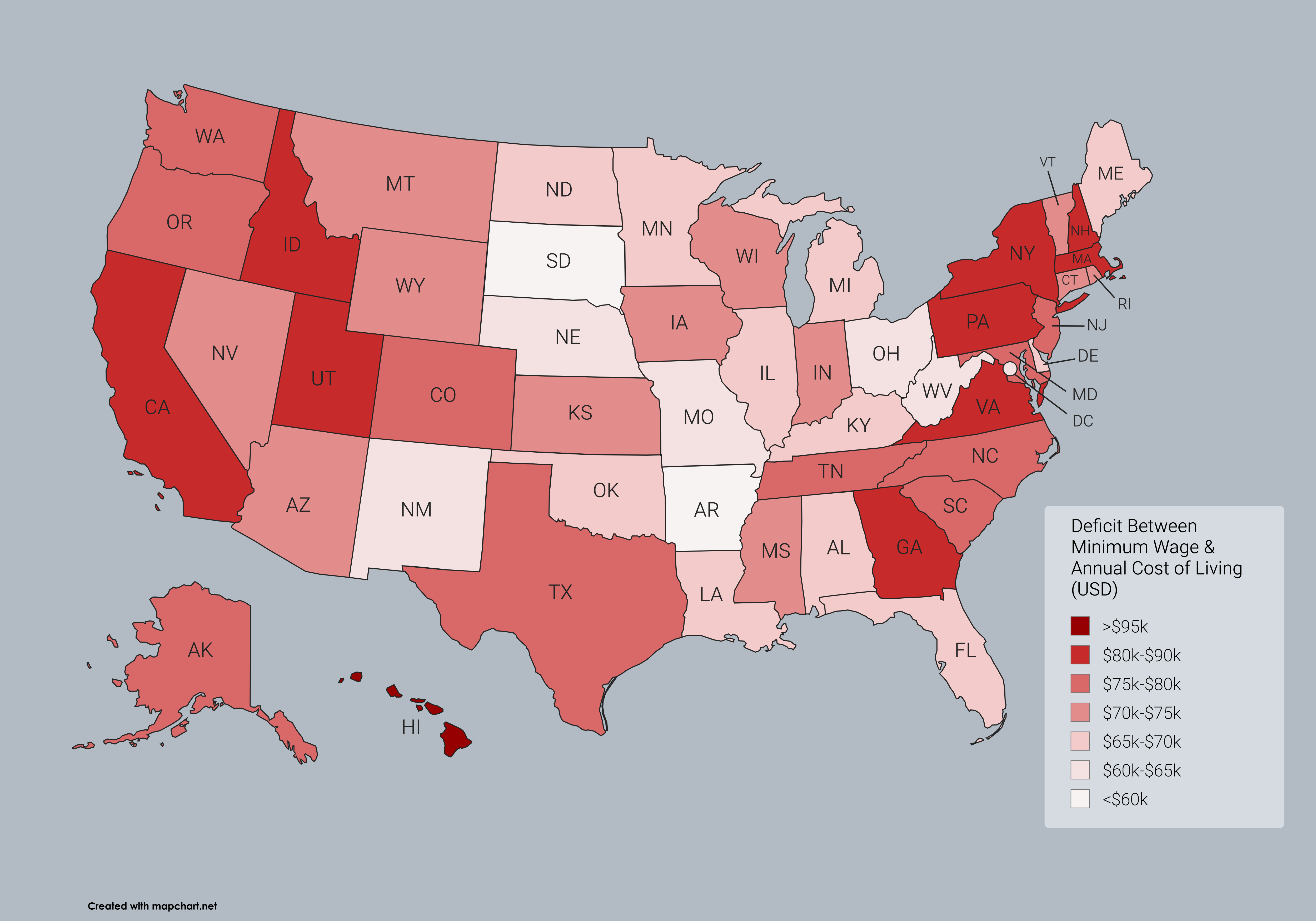
By popular demand, one last map to examine the absurdity of the American economy.
If you saw my map from yesterday that was up most of the day, please see the corrected version below. I done goofed hard on copying a column of state names. The original post has been corrected, but I will also post my previous two maps on this post for easy comparison.
Edit: the red map, for anyone unaware, is based on current individual state minimum wages and not the current federal minimum wage

6
Edit: the corrected map is now live
Out of curiosity, I wanted to see what a reasonable federal minimum wage might look like if implemented.
Looking at historical information from a time when a single individual’s income could support a family of four, I settled at the late 1950s.
The minimum wage in 1956 was finally raised to one whole dollar, the equivalent of about $12 today by raw inflation. However, its key to remember that this was an era when women were not paid on par with men, and when children younger than 13 commonly were in the workforce.
So instead I found average wage and salary numbers for 1958. In 1958, the average among all adult male wages was $4,888, and salaried men (doctors, lawyers, etc not included) averaged $6,514. Taking the salary figure and adjusting it for inflation gives you roughly $72k, or close to $35/hr.
If the average person had anywhere near the purchasing power of an individual in 1958, then no one could be making less than $35 per hour for their labor. Effectively, to return people to that level of financial security this is what it would take, while everything would simultaneously have to remain the same price. Meaning this wage increase would necessarily have to come out of the pockets of shareholders/owners.
The map shows quite clearly that even with such a high minimum wage, it would still be unaffordable in 100% of the country on 40 hours of work per week alone.
Trickle down economics have doomed this country on a path toward economic ruin, and have pushed most people in the US to such a precarious point financially that they have no hope of living as comfortably as the average worker in 1958. The average salaried worker today earns just $61k per year, over $10k shy of what the average worker made back in the day. Meanwhile, the cost of goods and services are astronomically higher.
$1 in 1956 bought you 4 gallons of gasoline. I pay $20 for that, even though by raw inflation the dollar is worth $12 today. Although gas is highly influenced by many factors that are unstable.
~~In the late 1950s, a cheap American car cost about $14k. The equivalent of over $168k today by inflation. By average salary, an individual could buy a car within 3-4 years easily by saving intentional for it. At modern wages, this would be impos. At $72k per year it becomes about as feasible as it was back then to reach that $168k mark.~~
These rough concepts are how I landed on $35 per hour as an appropriate measure. As well as the fact that wages today are almost entirely earned by adults, considering modern labor laws and the decline of the teenage workforce.
Edit: I just did the math for funsies, and 72,800 per year is about the appropriate income to afford the median rental price in the US (about $1900 in April 2025) or just shy of the median mortgage price of about $2,100 (also April)

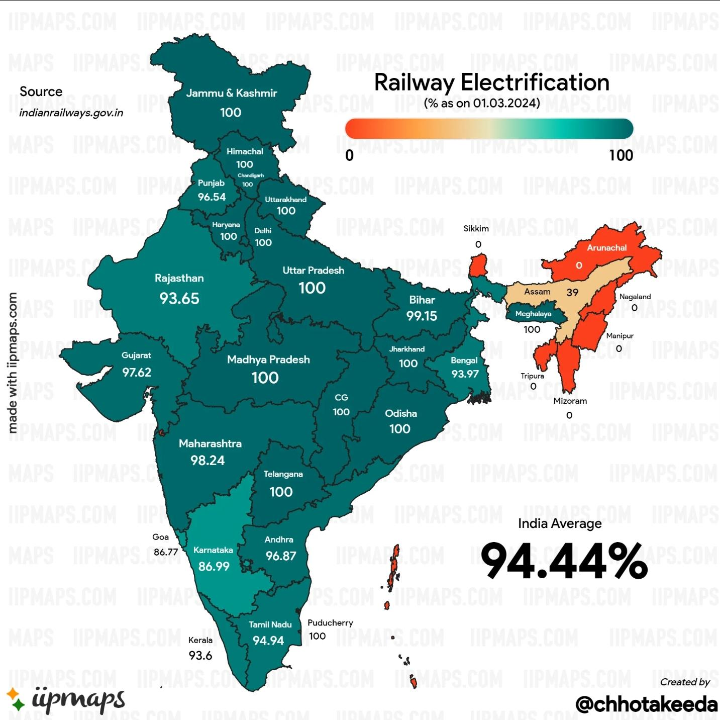
7
Only semi-beautiful, but I tried
Annual cost of living data according to SmartAsset 2025 Report, except for DC which is not included in their reporting.
DC annual cost of living was estimated to be $99,424 per separate data, however it may be outdated. This would place DC as less expensive than 18 states by 2025 numbers, which is probably lower than it should be.
Minimum wage income assumes 40 hours per week by 52 weeks a year at the minimum wage rate.
8
9
10
21
See the study here: https://www.thelancet.com/journals/lanepe/article/PIIS2666-7762(25)00111-5/fulltext
May 22, 2025 | Open access
Prevalence of myopia in Europe: a systematic review and meta-analysis of data from 14 countries
Although myopia prevalence increased in East Asian countries, the burden of myopia in Europe is less known. We performed a systematic review and meta-analysis to estimate the prevalence of myopia in Europe and at the country level.
We screened 2074 records and included 22 studies (from 14 European countries; n = 128,012) in the meta-analyses. The pooled prevalence of myopia was 23.5% (95% CI: 18.5–29.3; I2 = 99.7%), ranging from 11.9% in Finland to 49.7% in Sweden. In cycloplegic studies, myopia prevalence was 18.9% (95% CI: 13.2–26.5%; I2 = 99.7%) vs. 31.2% (95% CI: 24.9–38.3%; I2 = 99.3%) in non-cycloplegic studies. Subgroup and meta-regression analyses exploring sources of heterogeneity showed a lower prevalence in children (6–11 years; 5.5%) compared with adolescents (12–17 years; 25.2%) and adults (18–39 years; 24.3%) in cycloplegic studies. No significant differences in prevalence were observed between sexes. Myopia prevalence increased significantly between 2000–2010 and 2011–2022 (p = 0.040), although age-specific trends remained stable.

11
24
cross-posted from: https://lemmy.ca/post/44810144
The article and original title: Vancouver's new urban forest strategy faces challenges, academic says
Excerpts:
The city's goal is to increase its canopy cover – how much of the city is covered by leaves and branches when seen from above – from about 25 per cent of the city to 30 per cent by 2050, according to the updated urban forest strategy.
The plan sets a target to plant about 165,000 new trees over the next 25 years, and encourages residents to plant trees in their own backyards.
And while the plan has drawn praise from one expert, both city councillors and staff have acknowledged there will be difficulties in meeting the goals set out in the report.
In the wake of the B.C. government pushing hard for cities to increase housing density, Sheppard advised councillors to minimize the loss of existing urban trees when approving rezoning proposals.
The other map:
Multiple councillors pointed out the stark divide in canopy cover between neighbourhoods.
Shaughnessy has 41 per cent tree canopy cover, while Strathcona — which includes the Downtown Eastside — has only nine per cent.
The difference can be particularly significant during heat waves, according to the staff report, which says that vulnerable populations in low canopy areas faced a higher risk of heat-related deaths.
Coun. Mike Klassen asked staff to explore how to reduce urban heat islands in neighbourhoods with minimal tree canopy cover, including a "GreenShades" system that suspends large sails with planted greenery over streets.
The updated urban forest strategy passed unanimously with Klassen's amendment.


12
As smart speakers have hit the mainstream over the past couple of years in the United States and around the world, it’s important to take a moment to think of the many people who now share their name with an ubiquitous virtual assistant designed to serve its human overlords. And no, I’m not talking about you, Bixby. Imagine having named your kid Alexa shortly before Amazon debuted its popular virtual assistant in 2014. You now have to live with the fact that your child's name will forever be associated with the world's most popular digital servant.
As a matter of fact, there are clear signs that Amazon’s decision to give its digital assistant a rather popular name, has ruined that name for years to come. According to the U.S. Social Security Administration, the number of babies named Alexa in the United States has dropped from 6,052 in 2015 (which is when Amazon's first smart speaker Echo became widely available) to just 348 in 2024. Having been the 32nd most popular name for girls born in 2015, Alexa's rank dropped to 806th in 2024, the lowest it's been since 1985. Source.

13
14

15

16
17

18


20

21
22

24

25
view more: next ›