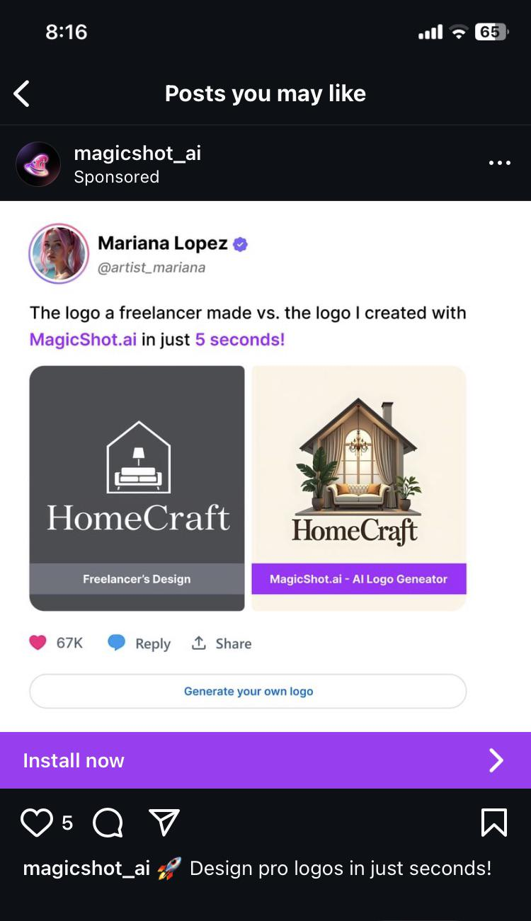
"I created" and "with AI" is the newest oxymoron.
Fuck AI
"We did it, Patrick! We made a technological breakthrough!"
A place for all those who loathe AI to discuss things, post articles, and ridicule the AI hype. Proud supporter of working people. And proud booer of SXSW 2024.
Art imitates life

Logo on the right is what you give a marketing team so they can tell you the 600 ways it won't print right, cost too much to display, and ultimately rework it into logo on the left.
AI generated art is the new "cousin who knows Photoshop".
This is fine, and mostly benign.
The one on the left is superior for a massive number of reasons.
Simple and easy to print, make copies of documents without becoming illegible, and other paperwork related reasons.
Easy to recognize at a glance. The one on the right is really hard to make out at a small size. Just a bland beige blob.
There is a reason most familiar logos are monochrome or only a few colors, and simplicity is one of them. The one on the right looks like overly bust clipart.
The one on the left is a couch inside a house with a lamp, all of which make sense together. The plants overlap the wall and there is a chandelier over the couch on the right one. Who puts a chandalier over a couch?
Ugh, I know it is obviously awful but I had to get it out.
so sayeth artist_mariana lmao
She’s an artist the way I’m a chef when I go to a restaurant and order food.
This is not an AI vs professional human issue, this is an issue with taste. You cannot prevent someone from pointing to the right option and saying "I want that to be my logo because it's a pretty illustration"
You can easily get ChatGPT to generate logos that are at least functional, give it a try. Start with
- What are the fundamental rules and standards of designing a logo?
- Based on these rules, generate a logo for the brand "HomeCraft" involving the shape of a house.
I'm not saying it comes close what a professional will give you, but it's a million times better than what your worst DIY client brings to the table.
That's fair. I think the biggest problem with AI logos is getting the AI to calm down. It can't help but to fill the slop bucket completely full; even if you tell it to keep things simple, it has an overwhelming urge to just keep pumping in more detail.
Imo, the left hand logo is better. Can you imagine trying to get the right side logo on a hat? Probably the best you could do for a reasonable price is a shitty screen print job that'll fall apart soon.
I decided to see what would be made following your prompt. Here's the image.

Seems decent. Doesn't really have the warmth of a home, but that's more on the prompt specifying house without further detail. I took it a step further and told it to add a couch and a lamp like in the logo in the op.

I definitely prefer the freelancer one but I don't think it's bad. Certainly better than the logo in the op lmao.
Edit: given where I am I should probably specify I think it's not bad compared to the trash fire that is the ai logo in the op. Design wise it's very lazy and looks like someone threw in a pair of icons from an icon pack into a house in a generic way. The two assets in the house do not feel like they exist within the same space.
The bottom one looks like there’s an old car in the house hahaha
What truly makes a house a home is parking a car in your living room.
I'mma be honest: I compared the two logos before reading anything, and absolutely loved the one on the left. It made me instantly want to learn more about the company. The one on the right just looks like a low effort depiction of the inside of a house, and I lost interest in what it was offering before I even got to the company name. I clicked in the post to put in my 2 pence, then read the whole image. Yeah... AI sucks.
What is up with the weird soft look that so many AI images have?
It’s probably trained on a fuckton of Thomas Kinkade paintings, just statistically, since his output was so huge. He also had that kind of lighting going on, so it wouldn’t surprise me if that’s just baked into AI image generation now.
