I…don’t hate it? Why am I not horribly offended by this?
this post was submitted on 13 Jun 2023
475 points (100.0% liked)
Programming
13992 readers
1 users here now
All things programming and coding related. Subcommunity of Technology.
This community's icon was made by Aaron Schneider, under the CC-BY-NC-SA 4.0 license.
founded 2 years ago
MODERATORS
Same thoughts here. Went in expecting to hate it instantly and found that it sort of looked nice.
This has me rethinking like two decades of coding. wtf.
Yeah, this has me intrigued. May try it out in vscode just for a lark. Possibly actually will be easier to read with some nice shapes...
I think some of the reason might be that Comic sans used to have really bad kerning. But with a mono font it is not really an issue.
load more comments
(1 replies)
Oh no, I was ready to pick up my pitchfork, but that is super legible. Brb, I need to go take a look at myself in the mirror...
Definitely makes sense considering some dyslexic people have found it helpful in terms of legibility
load more comments
(2 replies)
First of all, how dare you
Second of all, how dare you
Third of all, at least it isn't papyrus
Papyrus!!!!
I didn't want to wake up and start liking comic sans, God damn
This looks way better than it has any right to, I expected to hate this. Now I'm looking at fonts again reevaluating some shit
I came here to get mad but comic sans monospaced looks really good. I'm impressed. I might switch my IDE to this.
load more comments
(3 replies)
Oh no now I want to build a whole Arch rice around that font.
...no that's not enough.
we need ComicSansOS
load more comments
(1 replies)
Friendship ended with font gatekeeping and dogpiling, accessibility is my new best friend
If you like that, check out Recursive Sans & Mono
I wouldn't pick it over Fira Code but it has a bit of whimsy to it that reminds me of Comic Mono.
load more comments
(3 replies)
I mean Comic Mono is mentally relaxing and legible so great font of choice
I see serifs. You're a phony! A great big phony!
Comic Serif just doesn't have the same ring. Times New Circus?
Clown Gothic
Whoever owns this whole server can you ban this guy. This is a crime to humanity
Wow, poor comic sans didn’t deserve all the hate it got
I thought you actually meant the variable width font and I was about to report the post for gore.
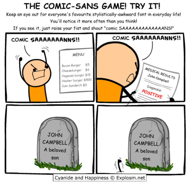
I will forever believe the comic sans hate is one of the internet's seemingly random circlejerks, like hating Imagine Dragons.
There were legitimate reasons from a design standpoint. It's badly balanced, the spacing is inconsistent...and it was everywhere.
Funny enough, I suspect what makes it a badly designed font might be why some people with dyslexia have an easier time reading with it. The badly balanced, poor spacing, probably made the letters in the font more distinguishable from one another.
If you (or anyone else that's interested) have the time, I think this article, "Why You Hate Comic Sans," goes over all of it pretty well.
load more comments
(2 replies)
I used to use Ubuntu mono but now I use Jetbrains Mono but damn that comic sans looks better than I'd expect I might even give it a try!
I tried that this morning at work, as a joke.
It was still there when I got off.
load more comments
(4 replies)
This is cute~! I hated comic-sans when seeing it on lots of tacky corporate and school signs etc. but recently I ironically and then unironically fell in love with its whacky-ness, bold-ness and readability, (I use a Samsung phone, and used PT Mono on the S9, but then future phones blocked custom fonts, so I used one hack-ey Comic-Sans version since my mono ones are so underground no one developed a phone hack - now any font is possible again so I'm using the one below~ )
A few years ago my fav. font became PT Mono, from Google Fonts - cyrilic compatible, it has these angular edges, and swoopy circle curves, so cute <3
THEN there was this font printed on 2011 Pentax Q cameras and lenses that I loved, and couldn't find the original, but there was something very similar, STALKER1 and related similar fonts
PT MONO
STALKER1
load more comments
(2 replies)
Comic Sans is actually really good for dyslexic people. It's why I usually use Comic Sans or Comic Neue when I print stuff out for my dad.
My original intention was to come here and proclaim that you're a heretic. Having looked at it for a moment, I think that you're onto something here...
load more comments
(1 replies)
pfft! Real devs use wingdings!
I run my real thoughts through a filter of chatgpt with instructions to make it work appropriate, edit font to comic sans, then vary the grayscale of each individual character before I send out emails to people I hate.
I've coded with comic neue https://comicneue.com/ over the last few years. I would definitely recommend it.
load more comments
(1 replies)
As long as it's a monospaced font I don't really care what the font is. (Wingdings excluded)
Might give it a try for a day.
I don't hate it? If this had ligatures, I would consider actually using it. I use Fira Code Retina for now but I'm always down for more options
Comic Code has ligatures, but it's not free. Still $30 well spent for me. https://tosche.net/fonts/comic-code
load more comments
(1 replies)
I'm going to try this after trying Intel's new font that's supposed to be made to accommodate for vision impairment.
load more comments
(1 replies)
Blatant trolling should be banned! Get the pitchforks everyone! :P
Ngl that is really easy on the eyes. Dammit.
Every PR you make is going to be denied.
I don't care it shows up as my BitStream Sans Mono, I know you write in comic sans, DENIED.
Tough, but ultimately fair
Surprisingly readable. Some of the letters are really close to each other, and multiple capitals together look odd. I will try it 🙂
I feel like a whole new world has opened its doors to me. I’m using this tomorrow at work.
load more comments
(2 replies)
It's interesting that you added serifs and monospacing to a sans serif font. It's almost like comic sans but with all the things that make it comic sans removed.
load more comments
(1 replies)
"Serious tho, Comic sans" four words I didn't expect today. Thanks for the heads up on legibility as a small font.
view more: next ›